Designed with Inkpad by Erick Villagomez

Erick Villagomez is an environmental designer, artist and teacher, who works with traditional and digital media. Erick has been using Inkpad to create a diverse range of vector artwork, many of which he has very kindly shared here together with annotations.

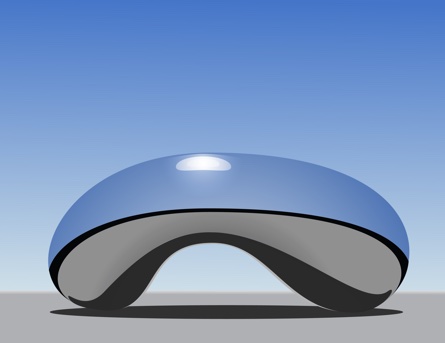
When I first discovered Erik’s artwork, I was taken by his amazing drawing inspired by the Cloud Gate in Chicago. I was so impressed by what first appeared to be a render, it inspired me to rethink the style and fidelity possible with Inkpad.

Graphic series.

"My earliest experiments with Inkpad. The focus was creating a strong graphic pattern and getting comfortable with the Inkpad interface."

"Attempting to capture the ‘roundness’ of the cylinder through properly placed highlights and shadows. Some thought went into capturing slightly more realistic light behaviour."

"A more surrealist piece that plays with subtle light and shadow effect available with Inkpad."

Smoke series.

"This series attempted to capture the atmosphere as the smoke from wildfires hung above the city where I live. Capturing visual gradients as things moved into obscurity was the focus."

"Vancouver’s Grouse Mountain under smoke."

"The sun, sky and rooftops of a local street in the later afternoon under wildfire smoke."

Reflections series.

"This series aggressively pushed capturing accurate reflection across extremely reflective surfaces. They are imaginary scenarios of natural and controlled lighting conditions. I wanted to test my ability to imagine how light would react."

"An imaginary study of a reflective black marble with a floating surface above it, under studio conditions."

"An imaginary study of a chrome marble surrounded by a barrier with a building in the background, during in the late afternoon."

"A piece inspired by Cloud Gate in Chicago: Cloud Gate in the desert."

"Experimenting with a bike helmet-like object."

"Study of a reflective orange marble with a barrier around it."

"An imaginary study of a reflective oval shape under studio lighting conditions."

Places series.

"Attempting to capture places and landscapes. Some were done directly on site."

"Although this was done while on Kew Beach in Toronto, I took a lot of liberties—deviating from the real—to simply try to capture the essence of the crowded beach with the city in the background."

"Attempting to capture the essence of English Bay in Vancouver during the sunset."

"Chilling out on the deck in Smoke Lake in Ontario one beautiful summer afternoon."

"Capturing light reflection and refraction in a shallow beach condition."

"The play of light on snow is amazing and intricate. I wanted to see if I could capture it somewhat realistically using vectors instead of digital paint. I think there is still much to be desired from my experiment, but I think several subtleties were captured okay."

Building series.

"Shows attempts to capture the built environment."

"An idiosyncratic window pattern in my area."

"A fictional ‘wall’ inspired by the work of John Hedjuk."

"A facade of John Hedjuk’s unbuilt proposals."

Letter series.

"Experimenting with potential graphics created using two randomly chosen consecutive letters. Although they don’t look like much, this was probably the most difficult exercise I have done to-date using Inkpad. I found it very challenging to think about letters as shapes alone and reimagining their graphic potential in different configurations. Going through font options alone took a long time. I started with the easiest graphic configurations—those that led to resembling a face. Then I added the challenge of not allowing faces. Tons of fun… and worth a try if you want to challenge yourself!"

"Graphic using letters a and b."

"Graphic using letters o and p."

"Graphic using letters c and d."

"Graphic using letters g and h."

"Graphic using letters s and t."

Illustration series.

"Puts aside the realistic in favour of a looser, illustrative approach."

"Pieces commissioned for a magazine that I decided to execute in Inkpad. I really wanted to play around with vector-based designs, instead of the digital paint I used frequently. The theme was Canadian Icons."

"Just having some fun playing with colour and depth."

"A little piece where I wanted to use a few shapes as possible to create a graphic for Women’s Day. There are six in total."

About Erick.

"I’m a designer and instructor out of Vancouver, Canada. I experiment a lot with drawing and sketching technique and methods, so am constantly experimenting with different media—analog and digital. Inkpad is currently my vector-based iPad software of choice and I’m constantly trying to push my own skills with it."

You can find Erick at Metis Design.Build and see an inspiring range of his diverse artwork on Tumblr and Instagram.