Designed with Inkpad by Felipe Villela
Felipe Villela is an art director and designer who over two years created a massive series of abstract geometric designs, sometimes on a daily basis. Most of these were created with Inkpad, then combined with Mextures to add texture detail and sometimes TiltShiftGen to add focus effects.
When I first saw Felipe's artwork I had the impression of getting a peek into another dimension or realm. It turns out this closely matched his intention, which you can read about in the notes Felipe has kindly provided.
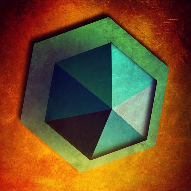
"It occurred to me that our mobile devices are computers and that I was only using it for social media and email. If I was going to stare at my phone for that long each day, I needed to find a way to make artwork. I began each of these pieces as vectors illustrations. The simplicity and versatility of the Inkpad app allowed me create the initial imagery. I would then move the images into Mextures and/or TiltShiftGen (both image editting apps) to add texture and depth to the images."
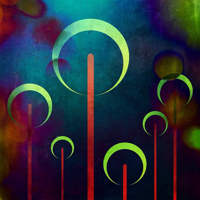
"This image was inspired by the explosions in animated shows I used to watch growing up. These were rockets/fireworks shooting into the sky and exploding."
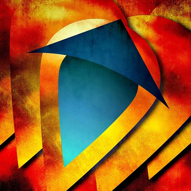
"This was an exercise in overlapping a shape to create depth. I was trying to make the larger shapes look like they were stacked and that the blue middle shape was cut out of the middle shape."
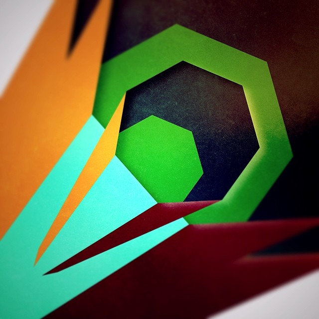
"I played a lot with layering to create depth and to try to catch the eye. The point of view here is of looking down a tunnel of sorts at the smallest green shape in the middle. It creates the illusion that the smaller shapes are nested in the larger ones but the gold and deep red slivers sit on top of it all. The intent is to make the viewer take a subtle role in the deciding what's happening."
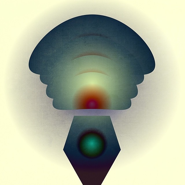
"The clean background and layering of the shapes create a simple depth to this image that I really enjoy. It brings me a certain peacefulness that I appreciate."
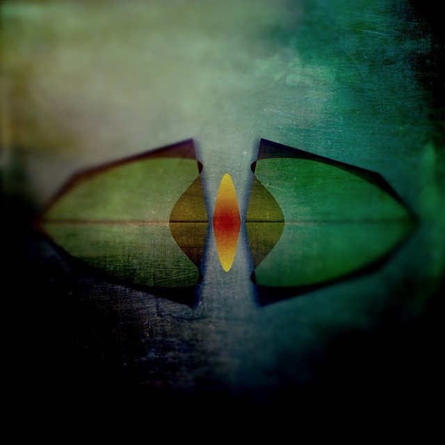
"In all these images, I'm trying to create a peek into another world. I tried to replicate the feeling of looking through a microscope/lens into a smaller world. I wanted a simple shape and spot of color and depth. I think the end result looks like the shell of an insect or other organic form."
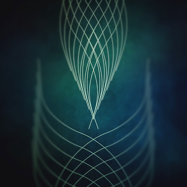
"I really like pinstriping and wanted to see if I could create something that looked like it with the apps. I'm pretty happy with the simplicity of the result."
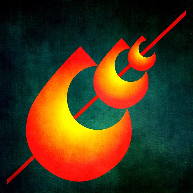
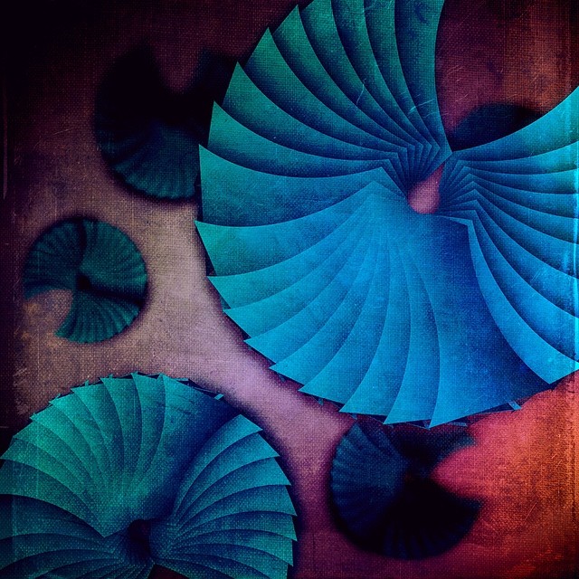
"I used repetition of shape a lot for a variety of effects. Sometimes for scale, sometimes for depth and sometimes just to drive the eye in a simple composition. In this case it was a simple composition of these shapes eating the smaller versions."
About Felipe's use of Inkpad.
"Inkpad itself proved invaluable to me. Since my goal was to use my tablet, I wanted something that gave me the clean results of a vector illustration but also had the flexibility to apply layer effects, drop shadows, masking, etc. I really tried my best to push the app to it's limits sometimes just to see what it could. That in itself would sometimes inspire certain works. Once I found out what it could do, I would focus on how to use that technique to create some new piece. So I let anything around me inspire me from my day to day physical interactions to my interactions with the app itself. It was a lot of work to post something almost daily but I did it and loved that I was able to really push myself and the apps for two years."
You can see more of Felipe's artwork on his design portfolio and all of his abstract project on Instagram.
